Building Name: Omnilinear
a. New Images
i. Set of 3 required images

BOLD
I really can't explain how much I like this image. This perfectly shows what Menis had suggested for my model, development of recti- and curvi-linear components so that each emphasises the other. Here the different components dominate different areas of the image, yet the balance is perfect, and the low angle projection really gives it a majestic feel.

BRITTLE
Adding a bit of nature and changing the style really helped show my building in a more realistic light. The glass area is central to the image (hence the 'brittle' caption), and I think it highlights how a room can stand out despite being in the midst of so much other detail. I should mention that I am aware members of the viewing public might get a bit more of a 'view' if they look up while in the indoor gallery space, but I will assure the female staff that skirts and dresses are probably not the best attire for work.

COARSE
A bit more texture is visible in this image, but overall the picture is designed to show all of the underground components and the way they work together. The glass prisms that let in light from the sun are an added feature to provide some natural dynamic lighting to what would otherwise feel like a very static space (the shadows for example would never change with only artificial lighting). Also note that the frames and rock act as dividers as well as thematic components, so the room is split into 4 roughly equal spaces, one for computer work, one for disassembling items that Gasciogne brings back to the studio to work with (e.g. road signs), one for reassembling them into a piece of art and one for storage or relaxation.
The texture is more related to the underground component of the model rather than the word "fragmented". Coarse is a feeling associated with rocks and rubble, and I tried to emphasise this with a semi-textured grid, trying to develop a sense of height to some parts and give the material some depth. I think this was relatively successful and works well when used to cover large walls.
ii. Studio Balustrade Images

b. Older Post Images (now including descriptions)
i. Original Sections + Design Descriptions (and some new pictures)

The original idea for 'mask' was based on that of a masking tape dispenser. The studio really taught me how an initial idea can evolve to form something entirely different. Right now the masking tape section, although it exists, is nowhere near as prominent as it was in previous drafts of the model. The stairs (which are based on the curves of facial contours [see below]) now encompass the whole structure, similar to how a mask wraps around the face.


I like this idea so much more because of it diverges away from the single blockiness of the previous design. As much as I didn't want believe it, Jules was perfectly correct in saying that the draft building looked like a flat shape that had simply been pushed through. After realising this and doing something about it, the above ground really took a step to becoming a much more interesting piece of architecture.
Using this model and after a brief discussion with Fernando Menis, I was able to emphasise the curves/contours by designing a primarily rectilinear front of the building. This is large, dominant, epic, majestic; to me the first picture of BOLD is just awe-inspiring. I should also mention that the curves are made from hollow galvanised steel for strength, and this was another suggestion made by Menis. There are two outdoor spaces that I constructed, both are simply for relaxing and getting inspiration from the surroundings. The top one also provides a view of the outdoor gallery below so Hall can observe people looking at her work. In terms of the experience of walking down the stairs, the curves that fall off to each side are designed to give the impression of walking down the bridge of the nose.
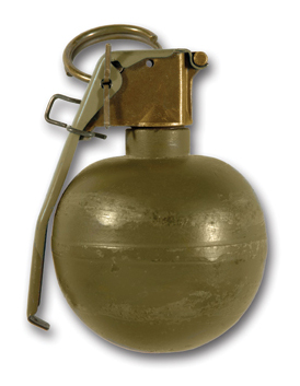
The below ground idea is based on the word 'fragmented'. It is designed around the explosive compartment of an M67 Fragmentation Grenade, and is loosely based on the internal structure, or at least my memory of it at the time of sectional design. The fuse shaft of the grenade is the spiral staircase. I used this staircase design because it was fragmented, yet from the top view looked still part of a whole, and this was later to be a major influence (especially after viewing the breaking glass video) in developing the rest of the underground space. After an initial draft (Studio Task 2) I found the section really limited the internal space, and I was unable to develop much creativity into such a room. My next approach (Studio Task 3) led to developing a 'cave' idea and opening the space out. Although this improved the design, it was now too big and full of empty space. For a studio it was simply too massive. The third and final design (ST3) was more focused on the grenade as a central component and the surroundings having a more fragmented feel. I developed this with the explosion in three categories; the shrapnel, the flames and the destruction to the 'environment' as you can see in the top view below.

.jpg)
This was developed through the metal frames and sheets, the warm colours and the lifted rocks/ground respectively. Also, although unable to be seen in the later images, the central column of the stairs is in fact a curved mirror. This reflects the fragmented surroundings in a distorted fashion, further adding to the experience of walking up (or down) the stairs. I should mention that the stairs are shown open in the model, but there is a mechanism that opens and closes a circular sliding cover. It is activated by sensitive force sensors on the corresponding step (lets say the one that is 3 above the viewing platform) and on the path an equivalent distance from the entrance. Also the run-off from the glass roof does go into a gutter, it doesn't just fall on top of the stair well.
ii. Texture and Materiality (some new images here as textures have changed since ST4)
ii. Texture and Materiality (some new images here as textures have changed since ST4)

The above ground texture is 'bold', and was sketched on the idea of thick dark segments. I've used the texture sparingly for 2 reasons. One, its current placement has meaning and adding it elsewhere will detract from that. Two, textures everywhere can create too much of a 'busy' feel to the building which I've already developed through detail and wouldn't like to pursue more. I've placed it inside the circle as it summarises the architectural theme of my upper ground studio, the interaction between recti-linear (the texture) and curvi-linear (the circle) components.

The gallery level texture is 'brittle', and was sketched with an emphasis on sharp sudden directional changes, similar to that of cracking. I used because of the brittle feel the gallery level (and the top level also) has due to the partly glass walls and the glass roof. I feel that, in a sense, the strong galvanised steel curves are protecting the brittle glass on the inside. The most difficult part in the later stages of the model was integrating the two linear components at the side wall. I opted for glass because, although flat and rectangular, it still shows the curves through it. To me the 'brittle' texture was a way of melding the textured solid wall with the glass.
The basement level texture is 'coarse'. Please see the description of coarse "a. New Images - i. Set of 3 Required Images - COARSE" for an analysis of that texture.
2. Created Animations
I've decided to explore my building through sections based on a small narrative-like sequence related to my section themes. Hope you guys like it.
Omnilinear; a guide for men in masks with fragmented minds...
PART 1
PART 2
PART 3
Best viewed in HQ using Internet Explorer. I'm not sure why the first video says 11seconds, it's 10 in Windows Media Player.
3. Links
I attempted to upload by Sketchup model to Google 3D Warehouse but has confronted by the error "Upload file size limited to 10MB". This is a bit of a problem when my model is 50Mb big. I've compensated by uploading it to FileFactory (link is below). Unfortunately FileFront was down at the time I tried to upload. I hope this is acceptable but there was no way I could reduce my model size by 5 times in order to fit it into the 10Mb limit.
http://www.filefactory.com/file/af83563/n/ARCH1101-EXP1-JarydCarolin-2009_skp
4. More images (you might be interested in)


